App Icon Design for ASO & Conversion
Quick answer: Your app icon is the most-seen visual asset you have: it appears in search results, charts, the home screen, and ads. It does not directly affect keyword rankings, but it heavily affects conversion: a clear, distinctive icon that's legible at small sizes wins more taps, and more installs feed your rankings indirectly. Design it for the tiny size users actually see, make it stand out from category conventions, keep it simple, and A/B test it.
Last updated: June 2026.
The icon is the first thing a user sees of your app and the last thing most teams optimize. It's in every search result, every chart row, every ad, and on every home screen, yet it's often an afterthought. This guide covers what makes an icon convert, how it fits into your wider App Store Optimization, and how to test it without guessing.
Why the icon matters (and what it doesn't do)
Let's be precise, because this gets oversold: the icon is not a keyword ranking factor. It contains no text the store indexes. What it does is drive conversion: whether someone taps your result instead of a competitor's. And since installs and conversion feed install velocity, a better icon helps your rankings indirectly. So the icon is a conversion lever, full stop. But conversion is one of the two halves of ASO, so it matters enormously.
It's also your highest-frequency impression: a user sees your icon every time you appear, long before they read a word of your listing.
Design principles that convert
- Design for the size users actually see. Your icon shows at roughly 60px in a search result, not the 1024px you design at. If it isn't instantly legible small, it fails. Zoom out and squint. That's the real test.
- Keep it simple. One clear symbol or mark beats a busy scene. Detail disappears at small sizes and adds visual noise.
- Avoid text. Words are unreadable at icon size and usually a crutch. Let the listing's title carry the words; let the icon carry the brand.
- Be distinctive. It has to stand out in a grid of competitors, not blend in.
- Stay on-brand. Use your brand color and mark so the icon, screenshots, and listing read as one product.
Stand out vs fit in
Every category has visual conventions: finance apps trend blue, meditation apps trend soft gradients. You have a choice:
- Fit in enough that users recognize you belong in the category.
- Stand out enough that you're not invisible next to ten near-identical icons.
The winning move is usually category-legible but distinctive: a clear signal of what you are, with one element (color, shape, mark) that's unmistakably yours. Study your competitors' icons side by side: the gap they're all leaving is your opening.
The icon is part of the whole listing
The icon doesn't work alone. It sets the visual tone that your screenshots and brand should continue. A premium icon over cheap-looking screenshots breaks trust; consistency across icon, screenshots, and brand color signals a polished product.
Test it, don't trust taste
The icon is one of the highest-impact things to A/B test, because it affects every impression:
- Apple Product Page Optimization lets you test alternate icons, but the variants must be shipped in your app binary (you select them in App Store Connect, you can't upload a new one mid-test).
- Google Play Store Listing Experiments let you test icon variants directly.
Change only the icon in the test, and let it reach significance. Teams are routinely surprised: the icon the designers love often loses to the simpler one. See app store A/B testing.
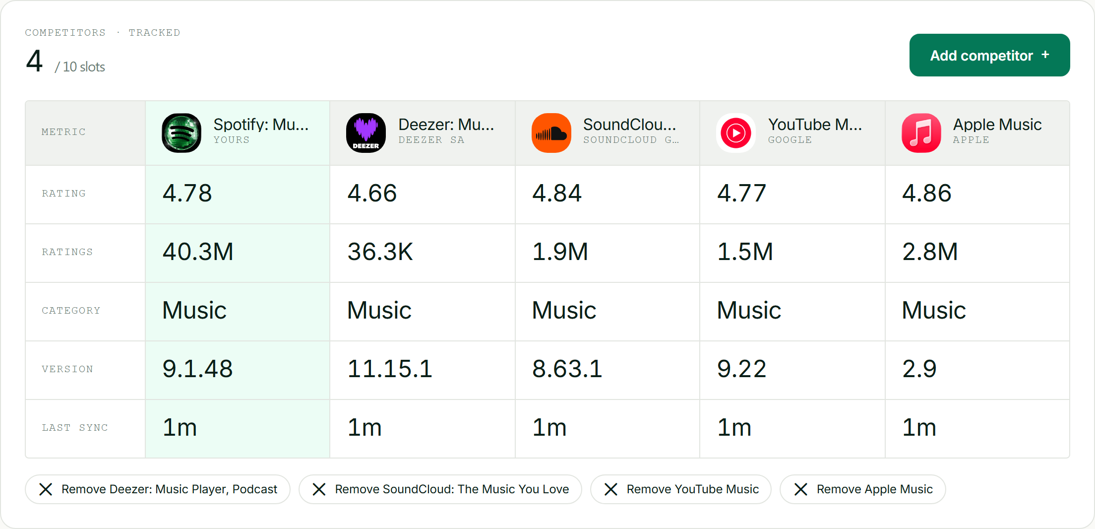
Compare your icon against every competitor's, side by side, before you redesign.
Localized and seasonal icons
- Localization: most icons travel across markets, but check that your symbol carries no unintended meaning or low contrast in a target market.
- Seasonal icons (holiday variants) can lift engagement and signal an active app, but keep your core mark recognizable so users still find you.
Common icon mistakes
- Designing at 1024px and never checking small: the only size that ships in results is tiny.
- Cramming in detail or text that turns to mush at icon size.
- Blending into category conventions so you're invisible in the grid.
- Inconsistency between the icon and the screenshots/brand.
- Redesigning on taste instead of testing, and sometimes torching a recognizable icon your existing users navigate by.
Frequently asked questions
Does the app icon affect ASO rankings?
Not directly: the icon contains no indexed text, so it isn't a keyword ranking factor. It affects conversion: a clearer, more distinctive icon wins more taps, and the resulting installs and velocity feed your rankings indirectly. So the icon matters a lot for ASO, just through conversion rather than keywords.
What makes a good app icon?
Legibility at small sizes (it ships at roughly 60px), simplicity (one clear mark, not a busy scene), distinctiveness against category competitors, and consistency with your brand and screenshots. Avoid text: it's unreadable at icon size. Design at full resolution but judge it tiny, because that's the only size users actually see.
Should I put text on my app icon?
Generally no. Text is unreadable at the size icons actually appear, adds visual clutter, and usually signals a weak concept. Let your app title carry the words and your icon carry a clear, distinctive visual mark. The rare exception is a short, iconic brand letterform that's legible small, but even then, simpler usually wins.
How do I A/B test my app icon?
Use Apple's Product Page Optimization (the icon variants must be shipped in your app binary, then selected in App Store Connect) or Google Play's Store Listing Experiments (which let you test icon variants directly). Change only the icon, run the test to statistical significance, and trust the conversion data over team preference: the favorite often loses.
Should I change my app icon?
Test before you commit. A better icon can lift conversion across every impression, but a recognizable icon is also how existing users find you on a crowded home screen, so a drastic change can cost you. A/B test the new icon against your current one and only ship it if it wins on conversion without confusing your base.
Icons pair with the rest of your visual assets: the store screenshot sizes reference and complete ASO guide cover them.